In crypto discussions, one sentence appears again and again:
“Altcoins are dead.”
It is a recurring narrative, especially during market drawdowns.
But narratives are not data.
Instead of relying on opinions, we decided to approach the question differently.
At Snow-Fall, we built a simple, transparent and reproducible framework to measure something that matters far more than hype:
Which networks actually outperform Bitcoin?
Every week we will track the performance of the main assets in the Snow-Fall Category 1 ecosystem and compare them directly against the market leader.
Not against the dollar.
Not against narratives.
Against Bitcoin.
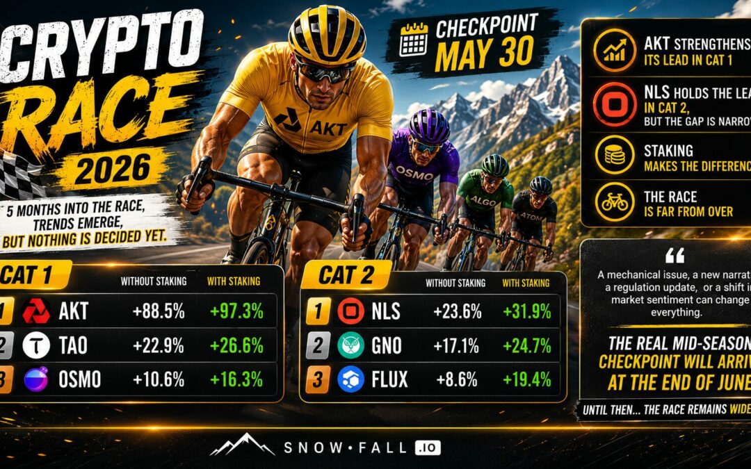
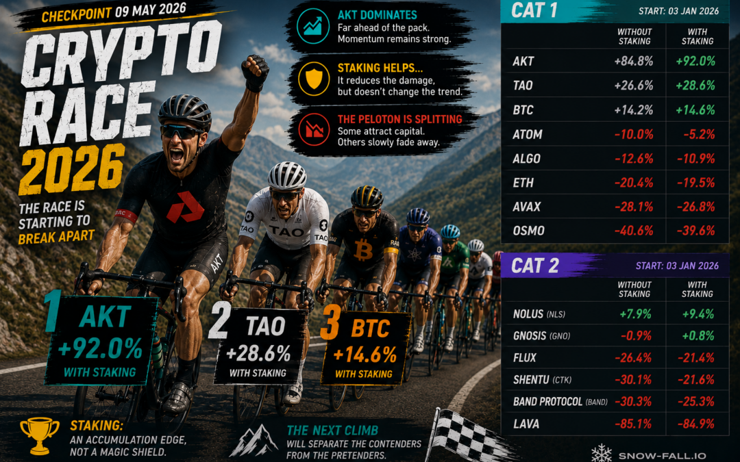
The Snow-Fall Category 1 Assets
This analysis focuses on the primary networks we follow and interact with in our infrastructure operations.
These networks form what we call Snow-Fall Category 1:
• BTC
• ETH
• ATOM
• AVAX
• ALGO
• TAO
• OSMO
• AKT
These are established ecosystems with real network activity and staking mechanisms.
Smaller or emerging assets will be evaluated separately in other categories.
Bitcoin as the Benchmark
Bitcoin remains the reference asset of the crypto market.
In traditional finance, the S&P 500 is used as the benchmark to evaluate equity performance.
The same logic applies here.
If an asset performs better than the benchmark, it outperforms the market.
If it performs worse, it underperforms.
Therefore the key question becomes:
Does a network beat Bitcoin?
The Investment Model
To keep the analysis neutral and easy to reproduce, we use a very simple portfolio model.
• $1000 invested in each asset
• Investment date: January 3rd, 2026
• Equal allocation across all assets
• No portfolio rebalancing
This creates a clean baseline for comparison.
The goal is not to simulate active trading strategies.
It is to observe how each ecosystem performs over time relative to the market leader.
Price Collection Methodology
Crypto markets do not have a natural “close” like traditional financial markets.
To simulate a weekly market close, Snow-Fall captures prices every Saturday between 00:00 and 01:00 (UTC+1).
This one-hour window helps avoid distortions that can occur when sampling a single second during periods of high volatility.
Prices are retrieved from multiple platforms:
• Binance
• CoinGecko
• CoinMarketCap
• CoinPaprika
Our system compares these feeds to obtain at least two consistent price references.
This cross-source verification helps reduce:
• feed errors
• isolated price spikes
• API inconsistencies
The result is a consolidated Snow-Fall reference price for each asset.
Integrating Staking Yield
Many market analyses ignore one of the most important characteristics of proof-of-stake networks:
staking rewards.
However, staking yield plays a real role in long-term performance.
For this reason, we integrate network staking returns into the analysis.
Important clarification:
The APR values used here come only from non-custodial staking methods.
This means:
• no lending
• no DeFi yield strategies
• no centralized yield products
Tokens remain 100% controlled by the holder.
The APR values used in the model are:
| Asset | APR |
|---|---|
| BTC | 0.95% |
| ETH | 3% |
| AVAX | 5% |
| ALGO | 5.6% |
| TAO | 4.5% |
| ATOM | 15% |
| OSMO | 4.8% |
| AKT | 11% |
To keep the model conservative, rewards are calculated using a simple prorated formula:Reward=APR×365Days
We deliberately avoid aggressive compounding assumptions.
Smoothing Market Noise — The SP21 Window
Crypto markets are extremely volatile in the short term.
A single week can easily distort performance comparisons.
To smooth these effects we also evaluate performance using a 21-day observation window (SP21).
The 21-day period roughly corresponds to one trading month in traditional markets.
This approach helps identify:
• structural trends
• relative strength between networks
• meaningful performance shifts
rather than reacting to short-term noise.
Relative Performance vs Bitcoin
For each asset we compute a simple but powerful metric:Relative Performance=Asset Return−BTC Return
This produces a clear signal.
Positive value → asset outperforms BTC
Negative value → asset underperforms BTC
This allows us to measure which ecosystems actually generate real market outperformance, not just nominal price moves.
Why This Framework Matters
The crypto industry often moves between extremes.
During bull markets:
“Everything is going up.”
During corrections:
“Altcoins are dead.”
Reality is more nuanced.
By comparing each network to Bitcoin and integrating staking yield, we can observe:
• which ecosystems remain resilient during drawdowns
• which tokens rely mostly on staking yield
• which networks maintain real relative strength
Data replaces narratives.
A Weekly Snow-Fall Benchmark
Going forward, we will publish this analysis every week.
Each report will include:
• performance since January 3rd
• relative performance vs BTC
• impact of staking yield
• SP21 smoothed trends
Over time this will create a longitudinal dataset showing how major networks behave across market cycles.
The First Results Are Coming
The methodology is now in place.
The data has been collected.
The benchmark has been built.
But the most important question remains unanswered.
Which networks are actually beating Bitcoin?
Your Turn
Before we publish the first results, we want to hear from you.
Which Category 1 asset do you think has performed best relative to BTC since January?
Vote or share your view:
• ATOM
• TAO
• AVAX
• AKT
• None — BTC still dominates
The Results
The first Snow-Fall Cat1 Benchmark results will be published this Wednesday.
We will reveal:
• the ranking vs Bitcoin
• which networks outperform the king
• and whether staking changes the outcome.
Stay tuned.
Because in crypto, narratives are loud.
But the data always speaks last.